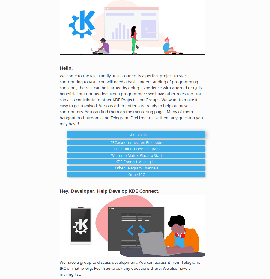

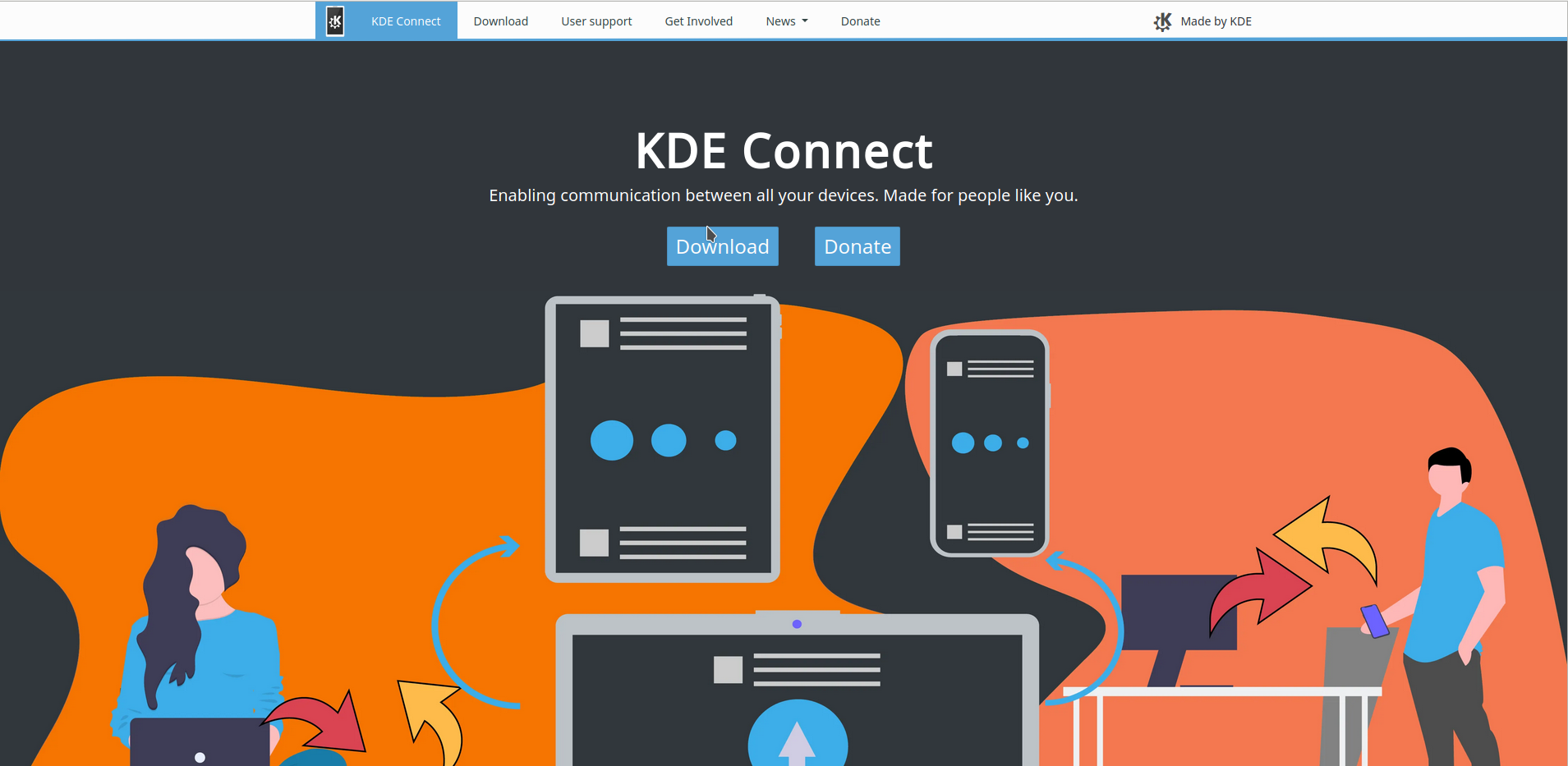
View the Website under work here.
Today marks the end of my second week of Season of KDE. This week had been great for me, I came in contact with many teams in KDE and got to work with many new people who are quite helpful and encouraging. Variety of changes came on the website which are linked above with links to commits.
The Website can be viewed here.
You can check out my proposal here. The repository that has the KDE Jekyll themed site is here.
This week started off by discussion on the Web Telegram chat on how the website behaved weird on devices with large screen and how some users and even my mentor Carl Schwan felt it a bit weird. So I went onto make the website more important. I decided to try the website out on all types of screen provided by the developer tools in Firefox and Chrome and also checked for Portrait and Landscape modes of all those devices. I can assure you that the website looks as it is intended on all these devices. So it should work fine on relatable devices. All this work was done with CSS.
Below are images of the website on large screen and the developer tools.
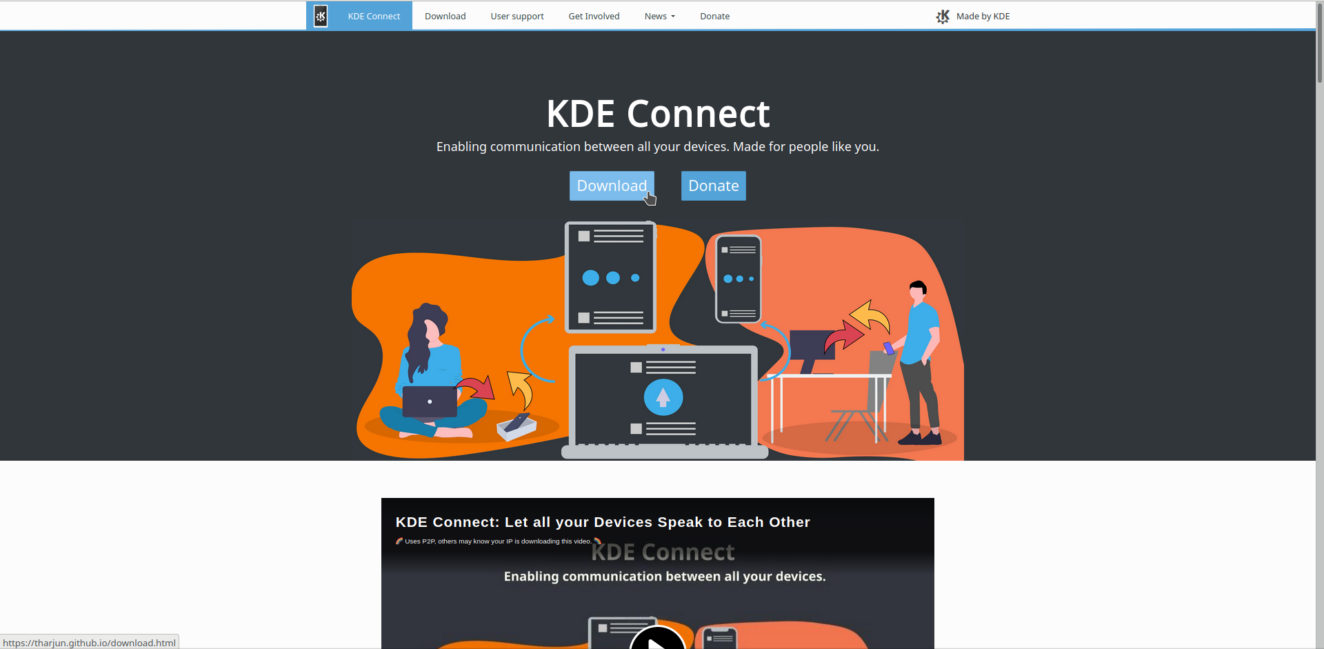
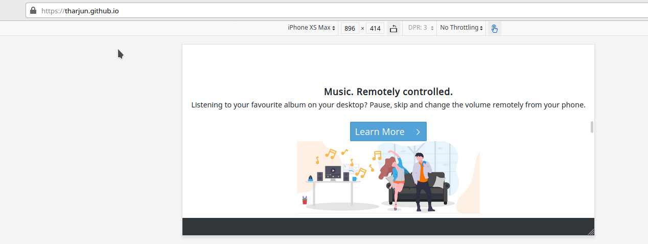 Now the user will be able to see the slides as a whole on most of the devices in both orientations.
Then I went off to get myself a Developer account on recommendation from Carl Schwan so that I can store the assets and files for the video on KDE Connect Website on share.kde.org in the Promo Groups Folder. I came in contact with some great people in Promo Group this week and really like what they do and effort they put in. Would love to help the Promo Group and work with them in the future. I am planning to be a active participant there too.
The assets, video files and Kdenlive Project File for the promo video is on share.kde.org
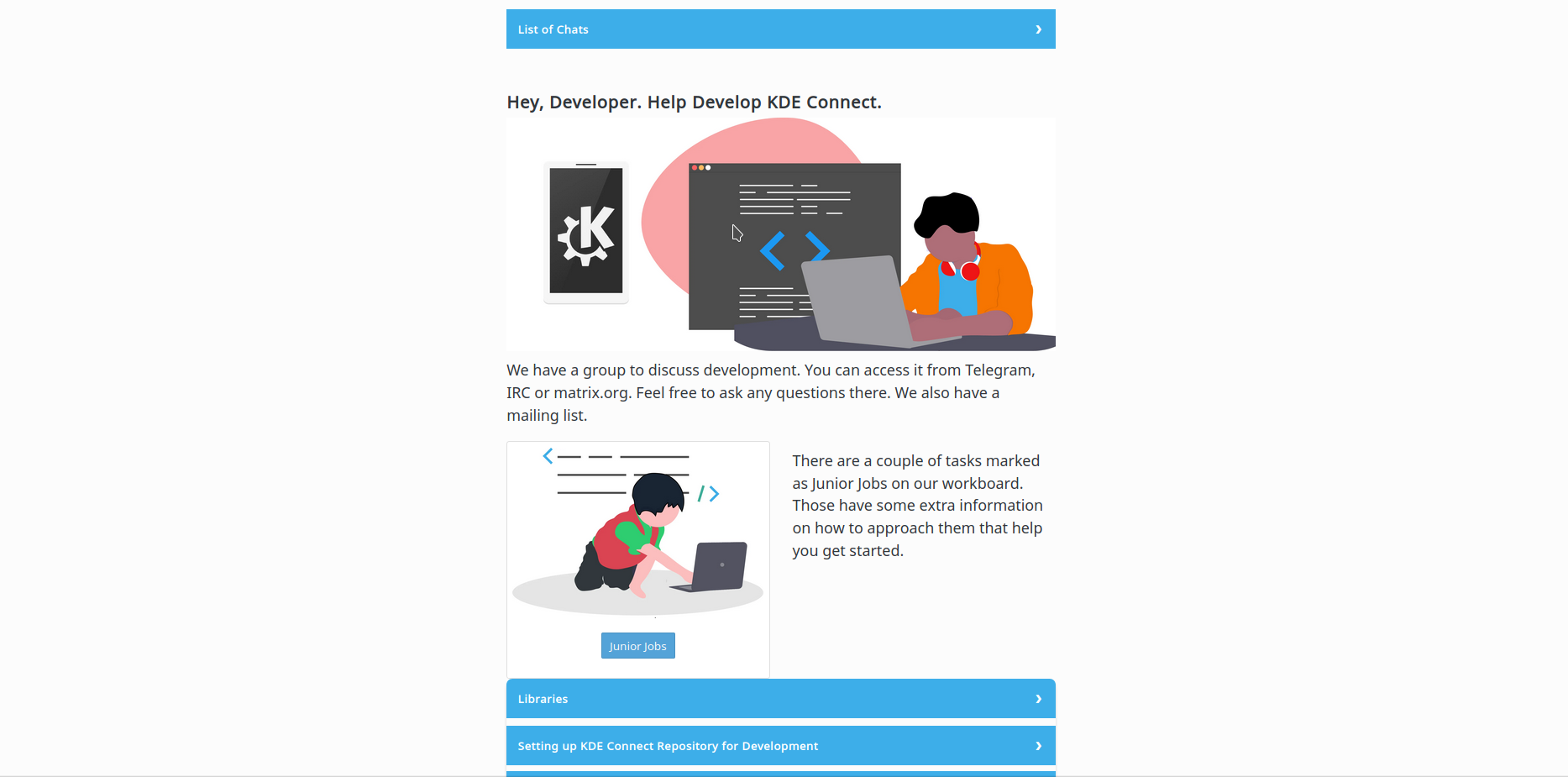
After a lot of discussion in KDE Web Group on the consistency of the Get-Involved Page and its button a variety of changes were made and everyone seems to be satisfied with the current look of it. Check it out. We actually came to the conclusion to use KDE Blue. There is some more work left there like updating CSS to make the edges sharp etc as it goes well with the rest of the Website.
This is how it looks now.
With the help of the Promo Team and especially Paul from Promo, I was able to host my video on Peertube channel of KDE Community and update the website to use that video.
This is the video on Youtube.
The rest of the week was filled with fixing css for get-involved page, changing the icon for User Base as the old one didn’t fit in well. The new icon is shown below.

The home page was also updated to alternating Dark and White Cards since it is aesthatically pleasing.
Waiting for an awesome next week too. Don’t forget to checkout the website. So with that I conclude this post. See you in the next one. “Happy KDEing!!”